
Lately, I find myself thinking back to my very first coding class in college, called “What is HTML?”. As rudimentary as it was, it was new to us all the same. We learned about tags and some simple styling techniques to build a page for your website, which as a front-end developer, it is typically my responsibility to handle the User Interface design and implementation as I collaborate with a team of several back-end developers.
I have only encountered pair-programming for HTML and CSS a handful of times, but I appreciated those opportunities to exchange knowledge, teach the basics of UI and help build the general skill sets of other developers in need of some front-end information.
For those looking for some basics, here are some essentials and key notes used every day in front-end work.
HTML (Hyper Text Markup Languages)
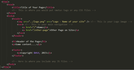
HTML defines the structure of a document (page). You can outline where your header, content, footer and any other sections will go on the page. Below is a skeleton of how your code could look for a general page.
There are many wonderful tutorials out there to walk you through how to write in HTML. One of my favorites is Codecademy: http://www.codecademy.com/tracks/web.
Once you understand and can use HTML well, the next step is learning how to style your webpages to look the way you want.
CSS (Cascading Style Sheets)
CSS defines the look and feel of the HTML elements. CSS properties use a cascading, waterfall effect to layer style rules and control the page layout and any visual characteristics it may have. CSS is powerful. Using it well is the base of being a front-end developer.
Many applications today use LESS or other variations of SASS (Syntactically Awesome Stylesheets), a dynamic stylesheet language that is compiled into a CSS file by your application. Using SASS allows developers to define variables inside their stylesheets. This is extremely helpful if you plan on using the same style (such as font color) throughout your website. SASS also gives developers the ability to nest their selectors inside other selectors, making the stylesheet shorter and clearer to follow by other developers.
Overall, using these other stylesheet languages gives the developer many opportunities that CSS does not support and allows for efficiency and minimal code repetition.
Now that you have created the outline for your content and made the page look the way you want, the next step in your front-end adventure is to understand all the uses of JavaScript and build some functionality into your site.
JS (JavaScript)
Generally, most developers have touched some JS at one point or another in the developer careers, but most have not had the chance to really learn what JS is and why we need it. JS is a dynamic programming language; basically, JS code executes at runtime instead of during compilation, as is done in other programming languages.
Using JS properly should enhance the UX (User Experience) of your site. You will be in full control of the behavior of the page with JS. Changing HTML as well as CSS dynamically is possible with JS and is useful in many occasions.
You can see the combination of HTML, CSS and JS in full use in open source frameworks available today. Two of my favorites are Bootstrap and ZURB Foundation. Building a site from scratch often comes easy by using one of these two frameworks to get you started.
You site is now beautiful! It looks great, functions well, now you need to be sure you are following standard guidelines and making your site accessible by anyone who could want to see it.
Accessibility
Having a site be “accessible” means that it does not contain obstacles that prevent interaction with or access to webpages by those with disabilities. All users on your site should have access to information and functionality on all web pages in equal capacity. Using the guidelines spelled out by W3C, you can understand the accessibility of your website.
These guidelines cover:
- being aware of the differences in new technology versus old technology and the need to stay observant of your site and how it looks and acts when using either
- being mindful of the possibility of user disabilities (ie: color-blind, deaf, etc..)
- creating clarity in design and text for all users
- building graceful style and functionality within your site
- and many other very useful tidbits to keep users happy and to keep them using your site without trouble.
Once you have reviewed and implemented any changes needed to follow W3C accessibility guidelines and you are ready to continue, the next best thing to focus on is performance.
Performance
When a user goes to a site have to wait while the homepage loads, there is very little time before they move on to the next site. Users do not want to spend more than a few seconds looking at a loading screen. They want their information now! Optimization is key to keeping your users.
Optimizing your website should become something you do throughout the process of building out your site and its content. Within the content of your site there are two big pieces that causes problems for performance: images and CSS/JS files.
There are a lot of resources out there for minifying (“the process of removing all unnecessary characters from source code without changing functionality”) both your JS and CSS files. Just this one change will decrease your website page load times and allow for quicker, easier use overall.
Check these links out and see what you think:
Minification typically occurs during the build process, for deployment of your code to the development/production site. You can do this by using tools such as Ant or Maven or Grunt.
Image sizes, file type and resolution are the other issue to focus your efforts. Making images smaller, while trying to affect the resolution as little as possible, is the main need. Different image file formats are needed for different reasons throughout a site; choosing the best one for optimal use is another positive use of your time!
There are three universally supported image types: GIF, PNG, and JPEG. Each types is used for a specific reason on the web:
- GIF, if you need animation in the image
- PNG, If you need transparency in the image or higher resolution image
- JPEG/JPG, if you need to optimize your images
There are many, many other ways you can optimize your site for better performance, but these are the two I suggest to focus on first.
In order to test the performance of your site you can take a look at any of the following sites. Some may be more helpful than others, but all are good sources of information:
- YSlow (add on for Chrome)
- Page Speed (add on for Google Developers)
- Hammerhead (add on for Firebug in Firefox)
- PageTest (test your URL on the web)
Making your site perform well is only the first step of optimization. Next you need to focus on your users. Are they able to find your site easily? Yes? No? Making sure you are up-to-date on the SEO of your site will help everyone all-around.
SEO (Search Engine Optimization)
An essential part of good web development is SEO. Structuring your code well ensures that your site gets properly indexed by search engines and is accessible to those with limited web capabilities.
The only place I go for SEO help is Google Analytics. Setting up a GA account for your site is highly suggested. This allows you to not only follow how your users got to your site, but also where they go once they are on it! Click the link below to get started:
Your site is ready!! Just kidding ☺ Before you can show the world your beautiful site, you must do cross-browser testing. Even though you may use Chrome 100% of the time, there are many other browsers used. Some styles or elements that look great in Chrome may look awful or not work at all in other browsers.
Browser Testing and Support
Cross browser testing does not just involve the desktop browsers. Now, you need to also consider mobile functionality. Making your site responsive to smart phones is a big part of styling now.
There are a lot of sites out there for testing across browsers, but the best resource is the browser itself. The only problem this causes is if you have a mac – you will not be able to download IE. Not having IE is a BIG mistake in the front-end world. Most UI problems come from the widely-used, terribly-buggy Internet Explorer. Then the online resources for testing browsers come into play.
Testing for mobile look can be done in most browsers with the respective developer tools or add-ons. Mobile functionality, however, is a little more different to correctly see in the developer tools provided. Once you get the look just right it is best to test the site on the mobile devices for proper functionality results.
Some of the tools I use:
- Developer Tools (built into Chrome)
- Mobile/Responsive Web Design Tester (Chrome add-on – used for mobile responsive testing)
- Developer Tools (built into Firefox)
With those key points in mind, you are now ready to begin developing your own web application! For more advice, feel free to check out our other blog posts.
Lastly, here are some resources I use on a regular basis that may come in handy while developing for the front-end:
- Symbol/Character reference: http://dev.w3.org/html5/html-author/charref
- Free fonts available through Google: https://www.google.com/fonts
- Checking support for styles across browsers: http://caniuse.com/
- Any other questions I have, I search here first: http://stackoverflow.com/

Comments