


June 26, 2020
In June of 2020, Snowflake announced Snowsight: the upcoming replacement for SQL Worksheets and is currently in preview for all users.
This article will mainly focus on Snowsight's dashboard features.
The dataset I'm using in this article is movie data from this public GitHub repository at the "American movies scraped from Wikipedia" link.
TLDR: Snowsight makes it easier to archive worksheets and its dashboard/visualization functions allow for quick exploratory data analysis (EDA). The only downside is that navigating between worksheets is a little clunkier than in the classic console. Skip to the "Overall Thoughts" section to get a more in-depth summary.
Snowsight Compared to SQL Worksheets
SQL Worksheets is an in-browser text editor and execution environment for Snowflake SQL queries.
The screenshot below is Worksheets in the classic console.
Individual worksheets (such as "script to initialize stuff" and "prep data for reports") are separated like tabs in a web browser. On the left side, there's an object explorer. In the center, there is the text editor and below is the results pane. Lastly, the top right of the text editor contains options for changing the execution context (role, database, etc.).
Snowsight is effectively a visually overhauled version of the classic console with a few new features. You can navigate to it by clicking "Preview App" as shown in the screenshot above. You'll have to sign in again, and it'll open Snowsight in a new browser tab.
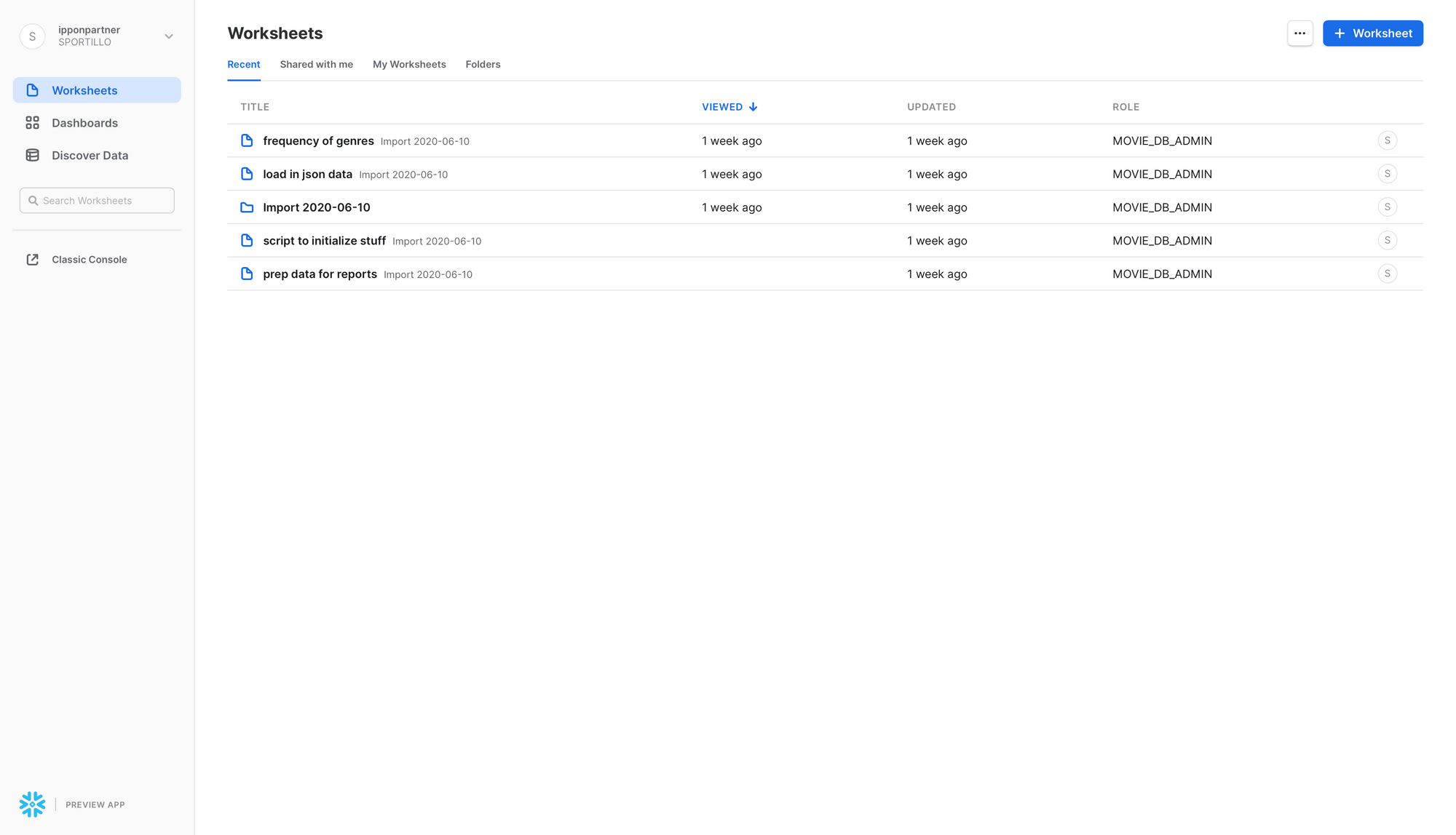
Here's the first page you see when opening Snowsight. The left side has options for navigating Snowsight. The "Worksheets" option is selected right now and it shows a sort of file system containing my worksheets. I think the file system is a new feature because I couldn't find a way to save worksheets in the previous console.
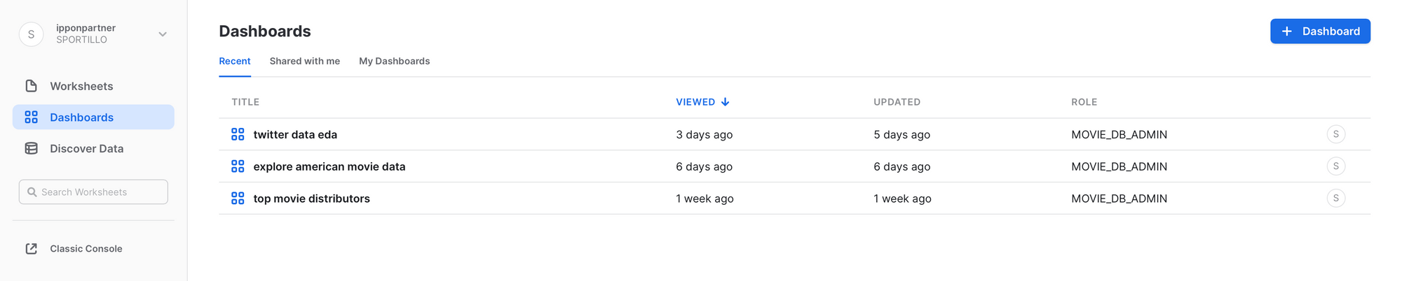
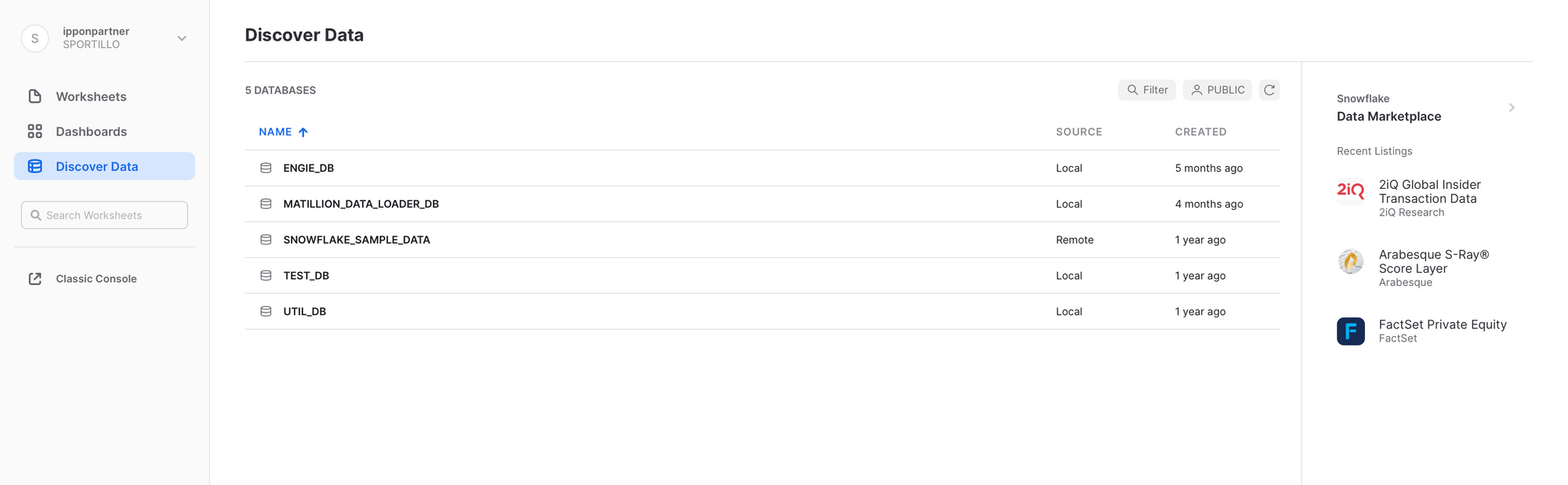
The following two images are brief views into the other two navigation options. You can see that they operate similarly to the "Worksheets" option.
Worksheets in Snowsight
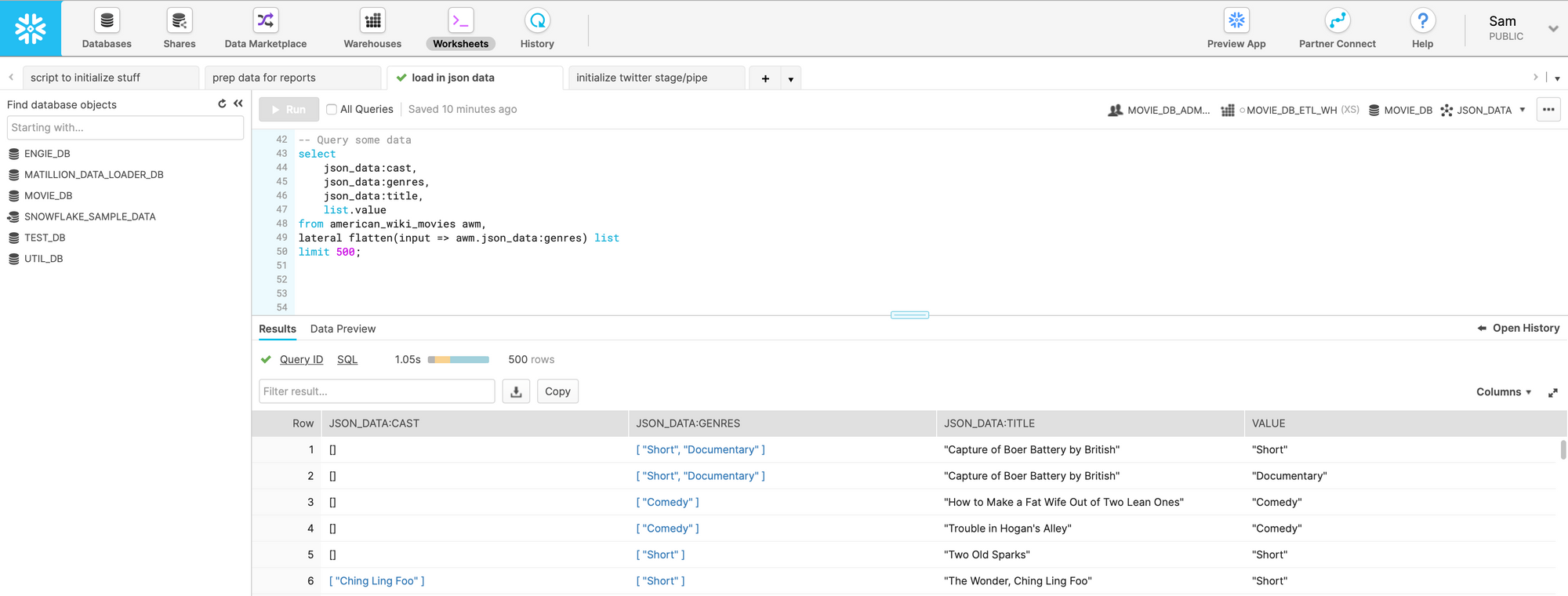
Here's how the same worksheet shown in the first image appears in Snowsight. I executed the same query to contrast the UI differences between Snowsight and the classic console.
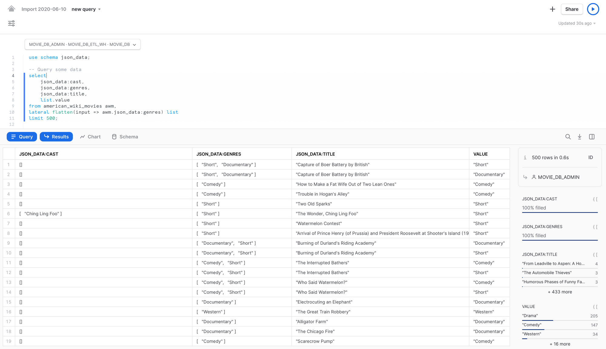
Snowsight's result pane includes some summary data to the right. I'm querying a JSON table and only flattening the movie genre column so the summary of that column can be seen under "VALUE". I'll touch more on applications of this in the next section.
Deep Dive into Snowsight Dashboards
The most notable feature with Snowsight is the ability to create and share dashboards.
Dashboards consist of tiles that are linked to SQL Worksheets. Each tile will display whatever the worksheet returned last.
The following SQL produces the top 10 most frequent movie genres, sorted in descending order.
select
    TRIM(list.value) as genre,
    count(TRIM(list.value)) as frequency
from american_wiki_movies awm,
lateral flatten(input => awm.json_data:genres) list
group by 1
order by 2 desc
limit 10;
Before playing around with chart settings, it looks like this in a dashboard:
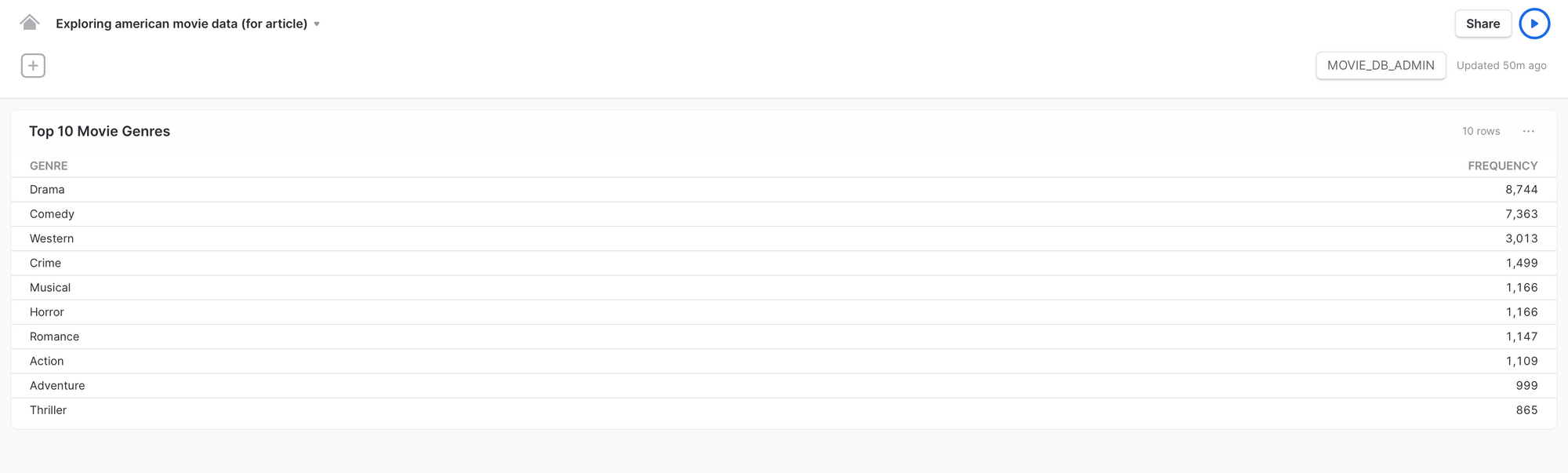
Like mentioned before, the tile displays the last thing returned by the worksheet. In this case, it's the results from the query.
If I pull the worksheet from the "Top 10 Movie Genres" tile back up and simply click the "chart" tab, below is what I'll see.
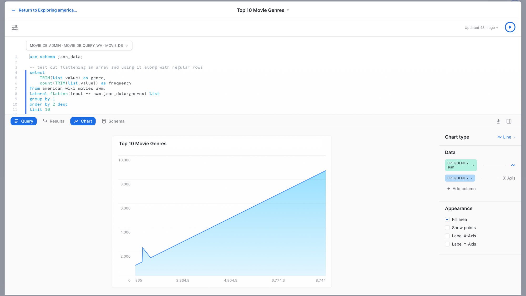
This is what is displayed by default when I open the "chart" tab. Snowsight enters the results from the query into a default chart.
I made the following changes to the chart settings:
- Switched "Chart type" to "bar". The options are "bar", "line", "scatter", "heatgrid", and "scorecard".
- Swapped the orientation to display the bars horizontally. (This option appears after I switch to the bar chart.)
- Swapped the y-axis to be the "GENRE" column.
Below is what I ended up with.
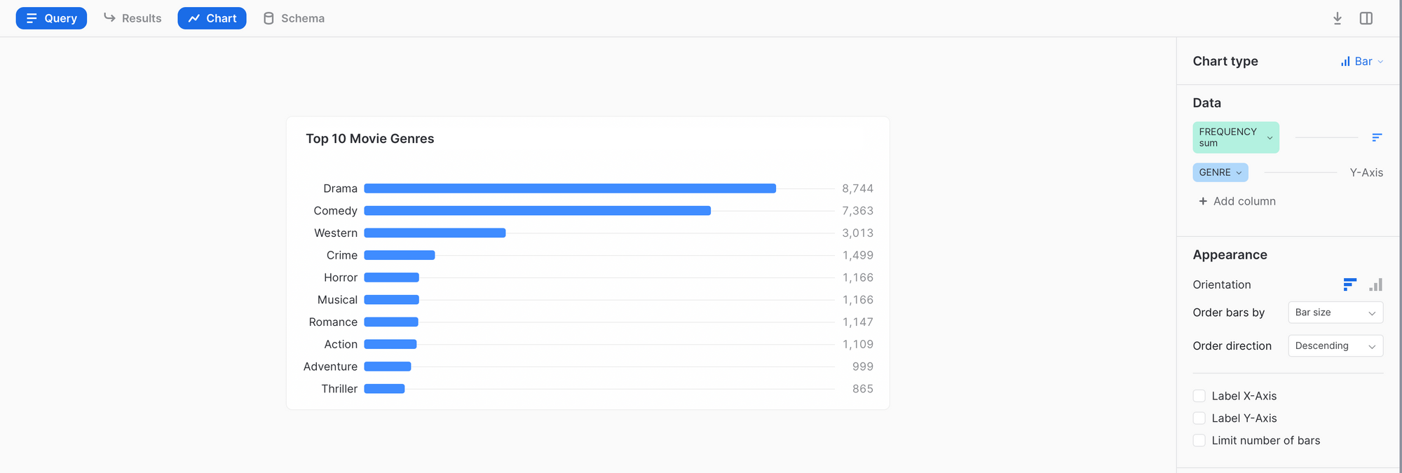
This created a visually appealing and insightful bar chart containing the top 10 frequencies for movie genres in the dataset.
I continued to play around until my dashboard looked like this:
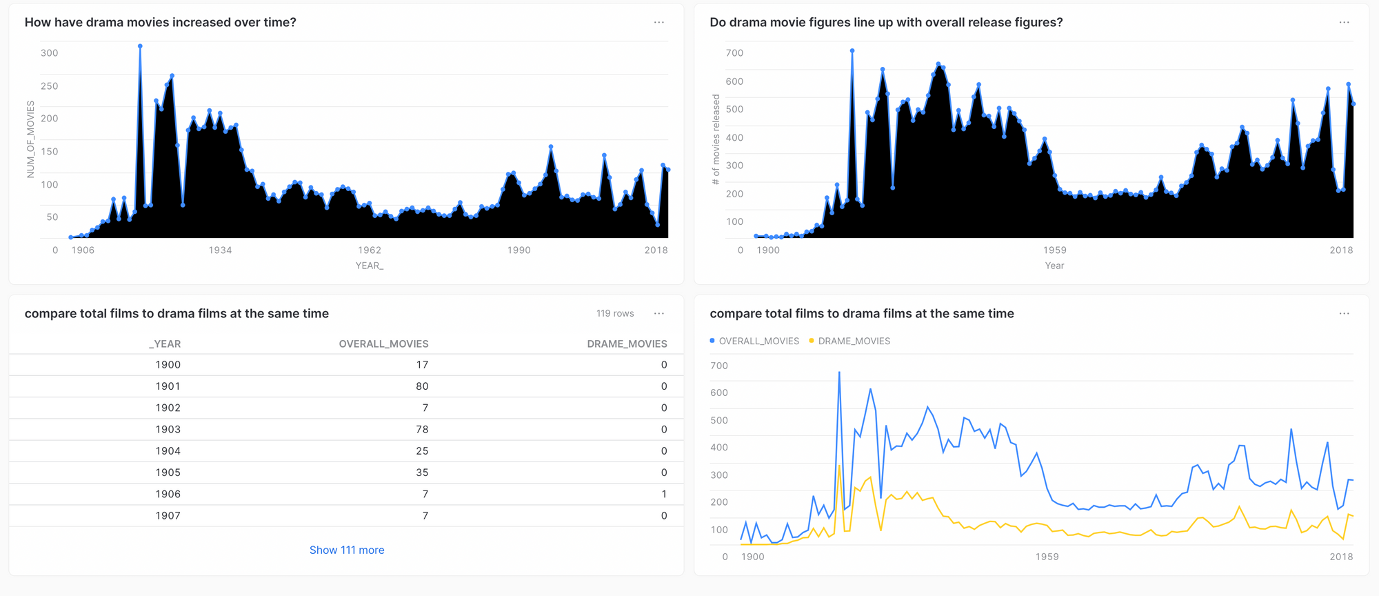
Note: Occasionally line graphs will automatically fill in with black for some reason...
Let's step through each chart (except the bottom left).
Top left: I continued to play around with genre data and decided to look at the "Drama" genre since it was the most frequent. I plotted the frequency of "Drama" movies per year.
Top right: To see how this compared to overall movie releases, I plotted total movies per year.
Bottom right: Both of the previous charts look fairly consistent, but to confirm I stacked both charts.
If I had to interpret this, I'd imagine that this dataset had been sampled by a larger dataset based on relative proportion of genre.
That basically means that a random number of movies was selected for each year, and within each year a consistent representation of each genre (around 40% for "Drama") was set before sampling.
For example, if 100 movies were sampled from 1906, then 40 of them have to be "Drama" movies. And if 200 were sampled from 1930, then 80 of them have to be "Drama" movies.
Overall Thoughts on Snowsight's Dashboards
Overall, I think that the dashboards are pretty handy. In combination with a strong knowledge of SQL and domain expertise, a user can get a lot of insight without having to involve external visualization tools. I was able to make all of the visualizations I wanted without much trouble.
Additionally, you can share your dashboards with colleagues in your organization but not with anyone externally, to my knowledge.
There's also an option to re-run all tiles in a dashboard, so if any new data has been added to the database, the visualizations will update accordingly.
When I first heard that Snowsight would include dashboards, I thought they would be dynamic dashboards that could respond to events and new data. But no, these dashboards are static and simply display the results of a manually executed query.
I'm not sure if Snowflake plans to make these dashboards dynamic at any point. I think a good use case for that would be to monitor a Snowpipe for any failures.
Conclusion
Snowsight's extra features will certainly help an analyst or engineer that uses the browser over the CLI. I think the added benefit of EDA with the dashboards is the big win here.


Comments