Welcome to this simple tutorial on how to plot a point on Two Axes using D3.js, a javascript library to visualize your data in an easy, modern way. As well, we'll be using both linear scaling and string interpolation.
Setup
- Grab the source code from the following link.
- After either downloading it as a zip or cloning it, use the following command in that directory to download the needed node_modules packages:
npm install- If you don't have npm installed, you can install it using these instructions.
- If it complains about permissions, try this command instead:
sudo npm install
- Run the following command to start your Http Server:
http-server -p 8888- If you don't have http-server installed, retry the above after running the command:
npm install http-server -g
- If you don't have http-server installed, retry the above after running the command:
You should now be able to navigate to the example UI by navigating to http://localhost:8888/src/alignment-axis.html
Features
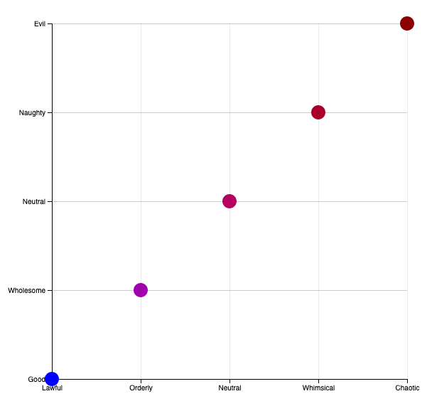
The code takes a linear scale from 0-4, maps those values to categories from the popular tabletop RPG "Dungeons & Dragons", then allows you to quickly plot a point on those axes by entering an X and Y value bounded by [0,4]. Additionally, the points plotted will be color scaled from Light Blue (Lawful / Good) to Dark Red (Chaotic / Evil). This is to make it a little prettier than using a standard black circle, as well as provide more visual feedback. Remember: visualization is about communicating data-- the more communication you have, the better!
The Code
Variables and Scales
width = 800,
margin = 150,
min = 0,
max = 4,
lawfulness = ["Lawful", "Orderly", "Neutral", "Whimsical", "Chaotic"],
goodness = ["Good", "Wholesome", "Neutral", "Naughty", "Evil"];
Height, Width, and Margin affect the size and spacing around the entirety of the graph.
Min and Max represent the domain of the graph-- what value do we start and end at? Since we have 5 items in our array, the scale would be from 0-4, in this case.
Lawfulness & goodness represent the two axis that D&D Characters are "aligned" to-- but in our example, it is the labels we want to use for our axis, basically.
var svg = d3
.select("body")
.append("svg")
.attr("class", "axis")
.attr("width", width)
.attr("height", height);
The above code simply selects the "body" element of the HTML page, and adds an "SVG" element to it, defining a class of axis, and giving it a width and height of the appropriate values. This is what will contain our two axis.
xAxisLength = width - 2 * margin;
yAxisLength and xAxisLength determine the size of those axes, which is scaled to the height & width of the SVG item we're working within, respectively, while also taking into account the margin.
var xScale = d3
.scaleLinear()
.domain([0, lawfulness.length])
.range([0, xAxisLength]),
yScale = d3
.scaleLinear()
.domain([0, goodness.length])
.range([0, yAxisLength]),
Here's where things start to get a bit fun! xScale and yScale create two linear scales from 0 to 4 (our max/min sizes), and set the Range to be from 0 to the length of that axis. Think of the range as a ruler, fixed in size, while "Domain" is the values on that ruler. For example, if I was to label each third inch on a ruler with it's own label (such as "A", "B", "C", "D"), then the domain would be 0-12 inches while the Range would be ["A", "B", "C", "D"].
colorscale = d3
 .scaleLinear()
 .domain([min, max])
 .interpolate(d3.interpolateHcl)
 .range([d3.rgb("#0000ff"), d3.rgb("#8B0000")]);
colorscale, meanwhile, takes a value from 0-4 and maps it to a color-HexCode from lightblue (0,0 or Lawful Good) to Dark Red (4,4 or Chaotic Evil). It does this by using D3's built-in interpolation libraries. The practical upshot of this is that the bottom-left of our graph will be very light blue, while the middle will be purple, and the top right will be dark red.
Rendering the Axes
Now let's look at the renderXAxis method to learn how we rendered the Axes. Note that the Y Axis is incredibly similar, so we will only be going over the X.
var xAxis = d3.axisBottom()
	.ticks(lawfulness.length)
	.tickFormat(t => {
	return lawfulness[t];
}).scale(xScale);
First we create an Axis object oriented to the Bottom of the grid. We then give it a number of Ticks equal to the amount of items in our array, and format the label of that Tick to be the string value in our array. Then, we use the xScale we created earlier to map this 0-4 axis to the size of our xAxisLength.
svg.append("g")
	.attr("class", "x-axis")
	.attr("transform", function() {
		return "translate(" + margin + "," + (height - margin) + ")";
	}).attr("opacity", 1)
	.call(xAxis);
Here, we are taking the SVG object and adding a new x-axis class object to it. The transform method provided will position it, giving us a way to easily map other points to it later. We're setting the opacity of this line to 100% (1) so that it appears bolder than the other gridlines, and passing the previously created xAxis object to the call method.
d3.selectAll("g.x-axis g.tick")
	.append("line")
	.classed("grid-line", true)
	.attr("x1", 0)
	.attr("y1", 0)
	.attr("x2", 0)
	.attr("y2", -(height - 2 * margin))
	.attr("opacity", 0.4);
Lastly, we will select all the ticks along the x-axis and create vertical line extending upwards. This will make it easier for humans to read it. Note that the opacity of these is set to 40% (0.4) so that they are not confused with the Axes lines.
The Circle(s)
function renderPoint(x, y) {
	svg
	.append("circle")
	.attr("transform", function() {
		return "translate(" + margin + "," + margin + ")";
	})
	.attr("cx", xScale(x))
	.attr("cy", yScale(y))
	.attr("fill", colorscale((x + y) / 2))
 	.attr("r", 10);
}
This rather small function will create a Circle object, use the same transformation as the original axis to put adjust for the size of the graph and the margins, then use the xScale and yScale to position it on that graph appropriately (with 0,0 being the bottom left and 4,4 being the top right). The colorscale will take the average of the X and Y values, and change the color of the circle from blue (0,0) to red (4,4) based on its position in the chart, making it more visually interesting. From there, if we want to render a point on the graph, we only need to call the method as so: renderPoint(X, Y);
Finale
    renderYAxis();
    renderXAxis();
    for (var i = min; i <= max; i++) renderPoint(i, i);
With these methods defined, we need only to call the two methods drawing the X and Y axis, which honestly could have probably been a single method if we got clever with the parameters, but I thought it would be easier to read for the purposes of this tutorial if we left them separate. Then, I have it drawing 4 circles, to help show how the color transitions.
I hope this walk through of my code example has been helpful to you; feedback is always encouraged and feel free to leave comments below if you have any suggestions or questions!
Comments