

The Responsive Web Design approach for the Liferay #3 portal: The often forgotten design
06 AUGUST 2013
BY ALVIN BERTHELOT
liferay-rwd, Mobile
In the previous article, we talked about the influence of the Responsive Web Design approach on the interest of your site/application/web portal of your users and how they could consume your features and your content.
Now you should have a clearer view (this is never set in stone) of your value proposition and a range of types of devices that you want to adapt.
This third article will elaborate on the design phase for the implementation of the Responsive Web design approach. While this article is more generally about the Responsive Web Design, we will begin to talk about the portal concept with its characteristics and a few specific features of the Liferay Solution.
The design
Before anything, let’s cut out the “very French” saying about design: “Yes, it’s a pretty design.”
The design is not only for aesthetic purposes; that is part of it. It is the creative process (this certainly explains the amalgam), which should allow you to find out how you are going to respond in a comprehensive and coherent way to a given issue. This can and should cover all aspects (social sciences, technology, the arts, etc.), which take part in this issue.
A simple example that is recognized by developers to convince you is the “Design Patterns.” You will find a simple, it’s pretty, you? This says nothing. It is a “pattern” (design master), which responds to a given issue.
In short, the issue that interests us is how to allow users to access the same content/features with different display constraints.
One of the key concepts of Responsive Web Design that responds to this issue, which you surely will know about, are the page layouts, which are structured differently, according to the different kinds of devices. And here is a striking example:

Source: Responsive layout
Given that you have defined the types of devices (and their specific points), you naturally want to create and redefine your page layouts to display according to the different types.
It is tempting but premature. It is good to want to structure your display, but you have to know what you will potentially put in it. The advantage of a Web portal, like Liferay, is its ability to create pages with a content panel. But what do you use this panel for exactly? And in what way?
The Content
Inventory of the content
The first step consists of quantifying and making an inventory by type of the existing content in your panel. Contrary to the classical approach to content inventory, which carries out a page-by-page scan, you should carry out a scan of available portlets. This is content in the form of page fragments for Java EE standard portals.
The listing of portlets is made on the basis of recorded portlets. For Liferay, this is the liferay-portlet (-ext).xml file. For each of these, your delivery record (spreadsheet) will have a line with the following characteristics:
- A technical username (for Liferay, available in the file(s) liferay-portlet(-ext).xml via portlet-name)
- The category of the portlet (for Liferay, available in the file(s) liferay-portlet(-ext).xml via control-panel-entry-category
- The title of the portlet (for Liferay, available in the file(s) Language.properties via javax.portlet.title.technical_username)
- The type of content (texts, images, formulas, etc) that they show. There are not any miracles. You will have to look at the source code.
It is unglamorous work, of course, but it is required, if you want to have a Web mobile migration. This even more the case with the Responsive Web design appoach. A “classic” Web Mobile migration allows you to detect future technological constraints on mobile devices. We won’t belabor this point, because it refers to the more generic Adaptive Web Design approach that we talked about in the first article.
For the Responsive Web Design approach, it is also important, because even if you are able to display a portlet, it may not necessarily be “well” displayed. The content in it must be flexible in order to carry out the Responsive Web Design approach. Otherwise, all the content is not equally flexible. Here are the main types of content and their associated risks (only on display constraints)
Types of Simple Content
- The text. This is the most used type of content and the most flexible good news, provided that the layout is not determined “hardset” and/or the words are easily scored.
- The formula: A formula can become flexible pretty easily, in general, provided that it is not too “customized” and follows web content standards.
- Video: It is easy to make it flexible, especially for the future container, the “iframe.” Activity that we will find in all third party video services. Nevertheless, there are bypasses for that. For example, the Foundation framework offers one of them.
**Types of “At risk” content **
- The “iframe.” It is not actually a type of content but rather a container. Nevertheless, you take it into account, because it has effects that are not to be neglected, since it often has fixed dimensions. You often have to find an adjustment on a case-by-case basis. This can become a puzzle. Embedresponsively is a tool that should help you with this task.
- Mapping: In general, it is still the case with an “iframe” that you can re-use the same approach. The problem is that it could cause problems with the cartographic focus and on the interactions. If it is important content that you want to display or that your users should interact with, you need to have to turn to a specific display.
- Graphics: This is a particular case, because it can be translated in different ways: images generated on the server, a third party service iframe,
Type of Complex Content
- Images: This is the black mark of Responsive Web Design today. By default, you can re-use existing images, but this risks not being optimized for high resolution screens and penalizes your users on small screens who have limited network coverage. There is no magic formula. You risk making major changes on the “front-end,” as well as the “back-end.”
Tables: In theory, they are flexible. However, it is very rare that the width of a smartphone screen is sufficient to display a table with a large number of columns in a readable way. There are several alternatives:
Delete columns if they are non-essential. Here is an example
- Insert a horizontal scroll. Here is an example.
- Implement a system of selecting columns to display those intended if you don’t need to make comparisons. Here is an example.
- Stop making tables and change the type of display if nothing is working. Here is an example.
- Navigation: This is another type of case where you cannot really talk about the content to be adapted. However, it is very likely that you will need to rethink it entirely. These navigation patterns (simple and complex) should help you.
In doing so, you have a comprehensive view of the quantity and the diversity of your content (types with display risks). This already gives you a good indication on the workload required.
Notice that in this step of the content type analysis, I qualify the risks but in a generic way. On this basis, I regularly mention “under cover” to recall that it is also conditioned by the existing one. In fact, you don’t migrate a portal with generic content but rather with a portal with specific content: yours. You need to qualify your existing one. That will help you with the next steps, the technical audit and the content audit.
Technical Audit
In addition to types of content, your portlets necessarily have structuring and layout, either directly in the HTML files (I hope that this occurs in the margin for you) or in the CSS files. You should look for everything that is not “easily” adaptable, such as fixed sizes and layouts with tables.
Content Audits
Whether it is by existing code for the layout or by typed content for the background, there is no doubt that the constraints on small screens didn’t even cross your mind a little while ago. Even worse, we proceeded with the reverse approach, and we were using growth strategy for screens: “When I have a new 19-inch screen to replace my 17-inch screen,” we wondered. And, this inspired principles that became aberrations today. Here’s a little sample:
- “You will have to put more content on this page because that one is really empty”
- “You would need a more consistent heading.”
- “I want a graphic which shows the results of the past two years”
This will have consequences today. Let’s take the same examples while using a smart phone:
- “It took 30 times for me to scroll on this page to get to the information that interests me. Worse still, the rest is completely useless.”
- “The header takes up the whole space and is unintelligible.”
- “This graphic is unreadable. I have to zoom two times before finding the results of last month.”
- “In short, the deletions and adjustments are imposed on your existing one. Here are the questions that you have to ask yourself:
- Keep in mind the quote from Antoine de Saint-Exupéry: “Perfection is acquired, not when there is nothing to add, but when there is nothing to take out.”
- Is all the content precise and concise?
- Can you have a more regulatory approach by fragmenting some content?
- Can you quickly identify the content?
- Is it readable and intelligible if we reduce the size by four times?
- Do you not need to display this data with another type of content?
The Layouts
** **Now that you know about content, what are your containers? And what could they look like in the future?
Layout Inventory
** **It is no secret that you take the same appraoch as for the content (e.g: portlets)
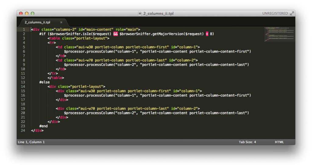
The listing of layouts is carried out on the basis of declared layouts (for Liferay available in the file(s) liferay-layout-templates(-ext).xml).
It’s not rocket science. You will just have to look at the source code layouts.
Let’s take as an example the layouts offered by default in the administration interface of Liferay:
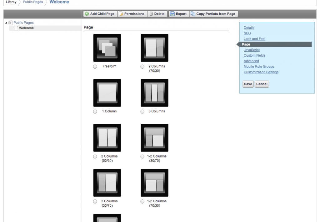
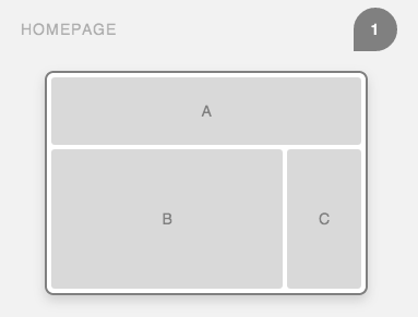
In particular, the “2 columns 30/70” layout:
The good news is that this layout is flexible (like others, moreover). The columns are expressed in % of width. They have a column at 30% and another at 70%. The width of these columns is going to be adjusted (retracted or stretched), depending on the available width (and only if your content is flexible) and also depending on the devices that will display the page.
It is good, but it is far from adequate. If you want to display a page on a smartphone with a width of 320pixels, 30% will only make 96 pixels, not to mention the eventual padding/margin, which will feed on this small nest egg of pixels. In short, there is not much that is left and the readability will be greatly affected.
By default, the Liferay layouts allow pages to be adapted (and there are a few CSS subtleties to modify, which we will see later), but they clearly show their limits in terms of visibility, because they use flexible and non-fluid grids.
Fluid Grids
** **First of all, what is a grid?
It is a “set of guides on the document that delineate the spaces where items will be placed.” It “rationalizes the organization of content and facilitates the existence of the designer (excepts from the conference, “The macrotypography of the web page,” which I recommend to you).
The concept of the grid comes to us from the printing press to structure the pages with an unchanging resource: paper.
As a new publication resource, inherited this concept from the printing press, except a web site has nothing that is unchanging. Rather, it is dynamic, flexible, fluid, and updatable.
**Fluid? **
** ****“The concept of fluidity has many meanings depending on the context of its usage” (Wikipedia definition). **
** **By combining the two concepts, we obtain a grid, which depending on the context (for our purposes, the display constraints) can apply these guides to position the parts in totally different ways.
Fluid
This takes on its full meaning with our previous example in columns of 30% and 70% on a 320 pixel. We can then modify the markers for the grid for this display of the two columns in two lines at 100% of the width in order to have accurate readability for the items which are in the first column.
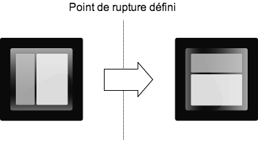
The combination of a fluid grid and breaking points is a key concept of Responsive Web Design. It is main reason that we have defined our breaking points beforehand.
It is almost indispensable to have one. And there are many CSS frameworks that are “all ready” to be implemented. The bad news is that there are so many that you have to choose among them.
Here are the “classic” requirements on the choice of framework applied to our particular case:
- Efficiency: Rapid understanding of the framework and easy integration with the existing one
- Features: The number of columns (8, 10, 12 16, 24 mainly), breaking points, by default, the realignment of proportions according to the type of device, the”Mobile First” or “Desktop First” Approach, etc.
- Performances: CSS file sizes to optimize loading performance
- Comptability spectrum: Listing compatible navigators
- Customization: Overload/CSS re-writing facilitated with source files, ideally with the use of LESS or SASS preprocessors
- Support and maintenance: Corrections and changes brought about
If you would like to keep your CSS style guides for your HTML components (that does not mean that you don’t have to rework them), a framework with just a fluid grid will work. You can choose between the following: 960 Grid System, Profound Grid, KNACSS (Made in France with French documentation for English native speakers), Fluid Baseline Grid, Base, and Proportional Grid.
However, if you want to change the CSS styles of your HTML components, you can choose from more complete frameworks: Bootstrap (Twitter), Foundation (Zurb), Kube, Topcoast, Pure, Skeleton, Metro UI, and Gumby.
These lists of frameworks are not exhaustive. You can still find a lot of them and you must make a selection.
If you like “homemade” things, nothing is stopping you from creating your own grid. Gridpak is an online tool which will help you and Susy is a creation framework.
Let it be clear that I chose to take into account the CSS framework of the fluid gird before carrying out prototyping. We are using migration optics, and in light of this, I preferred to take into account the existing layouts and CSS integration.
Another approach would be to prototype first whatever can facilitate the selection of the CSS framework and then the modification of layouts.
Prototyping
For the prototyping step, you start by knowing your content, your layouts, your fluid grid, and your breaking points.
You might think that this imposes a lot of constraints, but, in fact, the possibilities to design information are almost limitless.
Here’s my advice: don’t waste time modeling the future layouts on Visio, Balsamiq, or other mockup software. This will take a lot of time…
**Have a good crayon sketching session with people that can bring a capital gain to this phase **(editiorial contributions, UX designer, “front-end” developer, marketing, etc.). Be productive. The more you finish sketches, the more chances you will have to find the solution that meet the minimum requirements of the objectives of each dicipline.
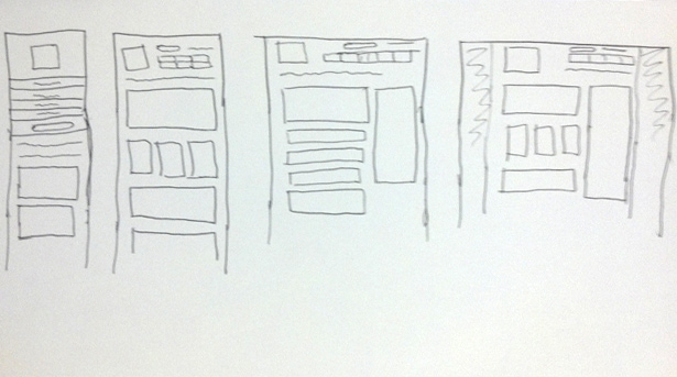
When you have this solution, go to the defined ring here below:
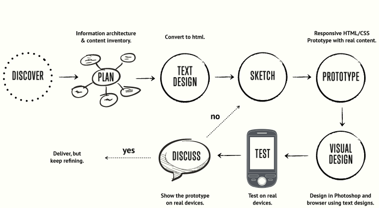
Source : Responsive workflow
Going directly to the HTML/CSS prototype will validate your feasibility hypotheses.
What follows is the graphic phase to design the layout. Here is my other advice for saving time. Make a graphical chart in Photoshop OUI, clarify the layouts in Photoshop NON, because it is time-consuming.
They will certainly come after you for not validating the prototype created. I know that this is not reassuring for the client or an MOA to not be able to see the final report But dissuade them, because the final report is not actually what it looks like. Personally, I call this, “a presentation suggestion.” All the conditions are met so that this looks perfect. The concern is that all these conditions are rarely met.
Instead, offer an applied graphics test to real life for the HTML/CSS prototype designed before that you want to develop by testing them on real devices, because that is a real final report that can be validated.
If this test does not work, then you will have to look at your copy again.
Conclusion
Let’s briefly summarize what we saw in this design phase:
- Inventory and audits on existing content
- Inventory and audits on existing layouts
- Choice of CSS framework that you want to use to create and redefine your layouts.
- Design of wireframes and certain specifications of results to be obtained
By discussing the design phase at the beginning of the article, you might have thought that it was going to be about the simplest phase. That is not the case.
A very dense, multidisciplinary phase makes your Responsive Web Design coherent with content strategy, wireframes, interactions, graphic identity (which we have not addressed), “front-end” development, and “back-end” development. This includes images, for example. The whole takes into account the existing one, which is not always simple and will change.
Know how to blend these disciplines in this design phase, rather than leaving the work isolated in “Water fall” mode, which plays a key role in this coherence.
When representatives of all of these disciplines meet minimum standards, it will be time to start the delivery phase, in order to completely verify what it yields. This will be the topic of the next article.

Comments