
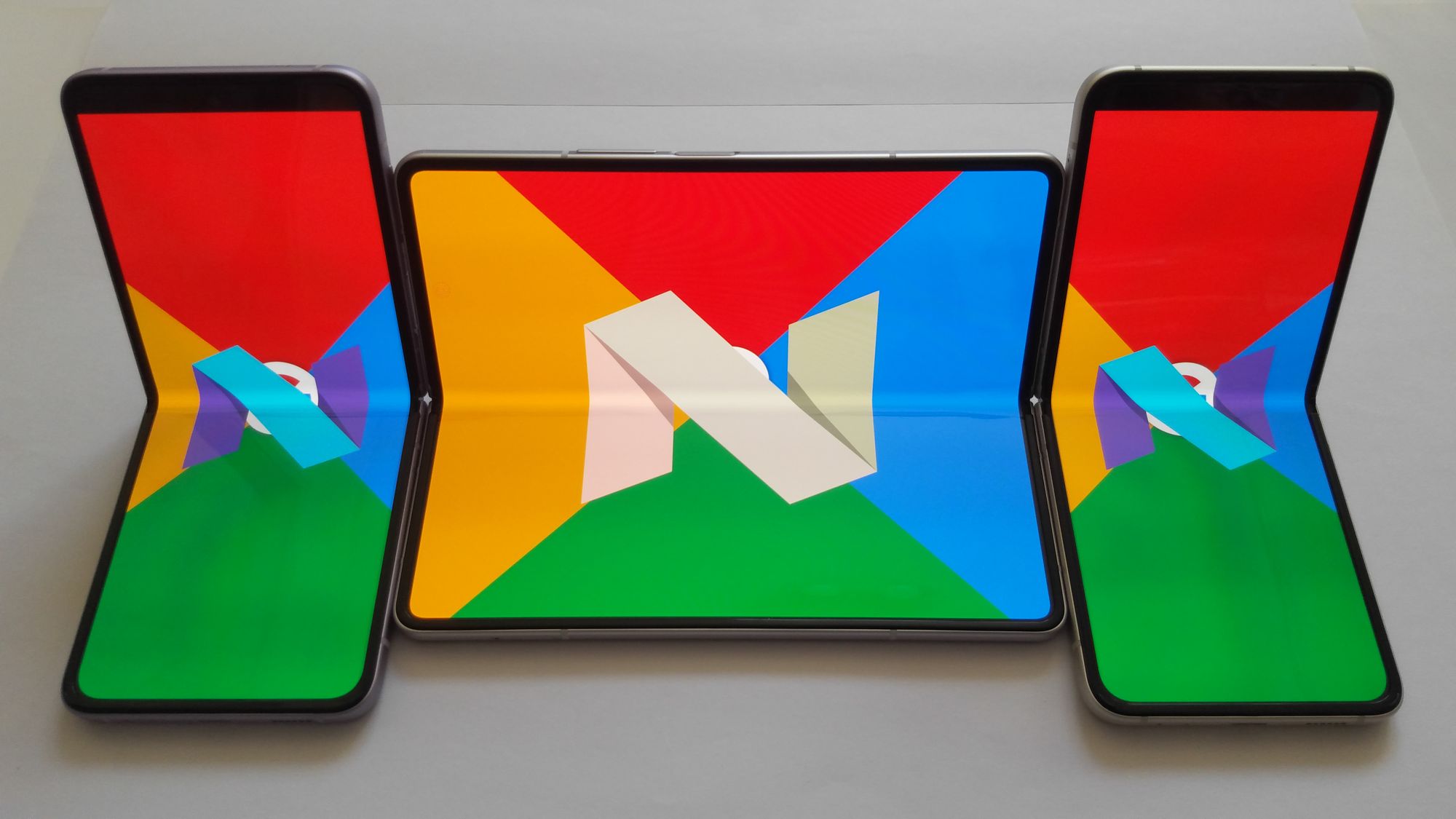
Today can be seen as the rise of foldable smartphones, as an increasing number of people are buying them. Numerous companies such as Samsung, Huawei, with a couple of actual devices that could be referenced via emulators below, are now manufacturing foldable smartphones. The goal of a foldable phone is to be able to touch multiple screens separately, but also have an adaptive user interface.
An adaptive user interface (also known as AUI) is a user interface (UI) which adapts its changes, layout and elements to the needs of the user or context and is similarly alterable by each user.
It means that the interface adjusts to the posture and layout changes. The various elements are fitted to enhance the user experience.
We might wonder how we could develop an application with Jetpack Compose for foldable phones. Thanks to Jetpack Compose, it is possible to develop applications for foldable devices with guidelines from Material3. In order to do so, the first step is to configure our work environment, adapt to different screen sizes and then track window layout information.
Configuration of Work Environment
There are different elements that a developer will have to configure to work on foldable smartphones with Jetpack Compose, such as a foldable emulator and its project dependencies.
Set Up the Foldable Emulator
Here are the different steps you will need to follow to set up a foldable emulator :
- Open device manager.
- Click on create device.
- Choose a foldable device (ex: 7.6 Fold-in with outer display or 6.7 Horizontal Fold-in) and its system image and click on finish.
Congratulations ! Now you have a new runnable device in your device manager :smile:.
Dependencies
The following dependencies need to be implemented to work on foldable devices :
// 1
implementation "androidx.compose.material3:material3:<m3 version>"
// 2
implementation "androidx.compose.material3:material3-window-size-class:<m3 version>"
// 3
implementation "androidx.window:window:<window version>"
//4
implementation "com.google.accompanist:accompanist-adaptive:<accompanist version>"
- material3 invokes Material3 components that can be used in application code.
- material3-window-size-class calls on WindowSizeClass (window dimensions breakpoints)
- window calls the Window Manager library to get a flow of window layout info.
- accompanist-adaptive a library providing a collection of utilities for adaptive layouts such as TwoPane, a user interface component that positions exactly two slots on the screen.
You will also have to upgrade kotlinCompilerExtensionVersion and org.jetbrains.kotlin.android.
// build.gradle app
composeOptions { kotlinCompilerExtensionVersion "1.4.0" }
// build.gradle project
id 'org.jetbrains.kotlin.android' version '1.8.0' apply false
Creating responsive components for different screen sizes for all types of devices will be possible with the following dependencies.
Adaptation to Different Screen Sizes
To achieve adaptation to different screen sizes, there are some useful guidelines to follow. The WindowSizeClass offers methods to deal with window breakpoints (A window breakpoint is a set size of a window that will change depending on the device and its orientation). Material3 comes with responsive layout rules. Let's review them.
Window size class
Window Size Classes are a set of opinionated viewport breakpoints that help you design, develop, and test responsive and adaptive application layouts. The breakpoints have been chosen specifically to balance layout simplicity and layout flexibility to optimize your app for unique cases.
WindowSizeClass allows adjusting both width and height and offers three possible breakpoints : Compact, Medium and Expanded.
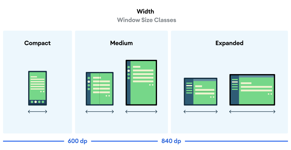
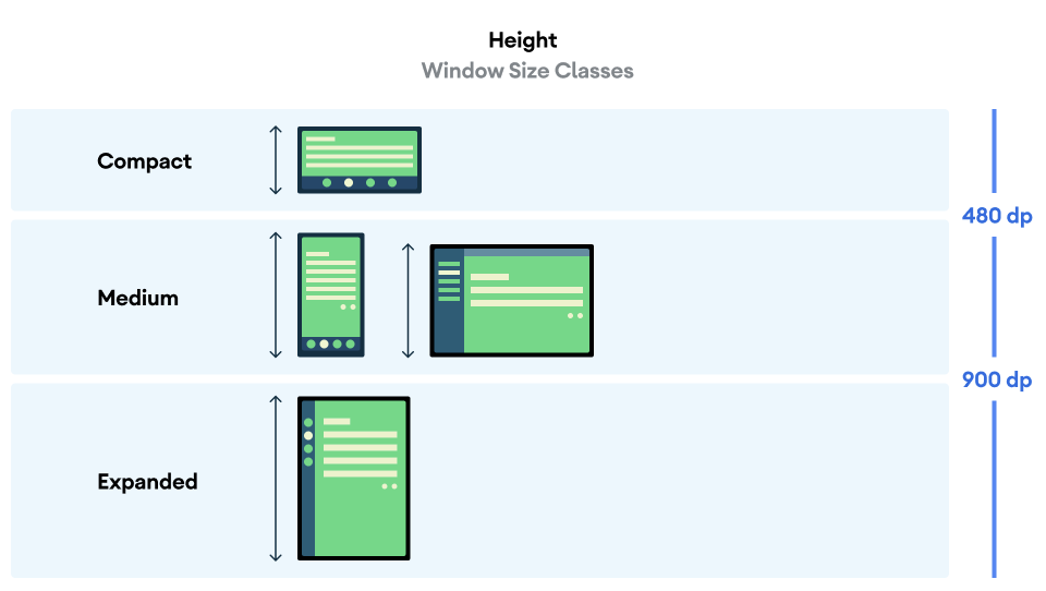
These breakpoints allow the developer to focus on the layout according to devices or/and particular pages of the application. It easily allows the effective use of the available space.
To go further with implementation details, you can have a look at Window Size Classes.
Responsive layout
The goal of a responsive layout is to adapt the user interface to the window size. To create a responsive layout in Jetpack Compose, we can use the windows breakpoints. Two ways are available to us to calculate the window size in Android Jetpack Compose. We can use either of the following methods :
// Calculates the window's [WindowSizeClass] for the provided [activity].
fun calculateWindowSizeClass(activity: Activity): WindowSizeClass

// Calculates [WindowSizeClass] for a given [size]. Should be used for testing purposes only
fun WindowSizeClass.calculateFromSize(size: DpSize): WindowSizeClass
Nonetheless, be wary of these methods as they are still experimental. The method calculateWindowSizeClass is the only one recommended. WindowSizeClass contains a WindowWidthSizeClass and WindowHeightSizeClass, representing respectively the window’s width and height. Each class will have its own instances of Compact, Medium and Expanded. According to the width and height of the screen, it makes it easy to organize the code to have a responsive layout. I advise creating a sealed class Dimensions and the composable WindowResponsiveDimensions as below :
/** * Declare which window dimension to use [WindowWidthSizeClass] or [WindowHeightSizeClass]. */
sealed class Dimensions() {
	object Width: Dimensions()
	object Height: Dimensions()
}


/** * Will decide which composable to call with [windowSizeClass] and [dimensions]. */
@Composable
fun WindowResponsiveDimensions(
    windowSizeClass: WindowSizeClass,
    dimensions: Dimensions = Dimensions.Width,
    compact: @Composable () -> Unit,
    medium: @Composable () -> Unit = compact,
    expanded: @Composable () -> Unit = medium,
) {
    when(dimensions) {
        is Dimensions.Width -> {
            when(windowSizeClass.widthSizeClass) {
                WindowWidthSizeClass.Compact -> compact()
                WindowWidthSizeClass.Medium -> medium()
                WindowWidthSizeClass.Expanded -> expanded()
            }
        }
        is Dimensions.Height -> {
            when(windowSizeClass.heightSizeClass) {
                WindowHeightSizeClass.Compact -> compact()
                WindowHeightSizeClass.Medium -> medium()
                WindowHeightSizeClass.Expanded -> expanded()
            }
        }
    }
}
In the end, by also following the Material3 recommended guidelines, we are able to create responsive layout windows. For more details, consult Layout - Material3. The responsive layout should adapt to every kind of device, even foldable. The window layout information will help create a responsive layout for every device.
Window Layout Information
Android is able to manage window information with a listener. With window information we can adapt our personalized windows to the environment changes. First, we will see how to track window information, then what are the folding states.
Track Window Information
In Android, the library WindowManager is used to track window information. The Window Information will return a list of DisplayFeature. This list provides the window bounds but can also be interpreted as a FoldingFeature, a direct subclass of DisplayFeature. For more details, consult the following pages :
In Jetpack Compose, we can find the following method :
@Composable
public fun calculateDisplayFeatures(activity: Activity): List<DisplayFeature>
It helps to calculate the list of DisplayFeature from the given activity by using the library WindowManager. It creates a produceState to update the list when changes are invoked.
We basically need this list to use the TwoPane method. It takes six parameters as follows :
- first: the composable content for the most left or top side screen of our device based on the SplitResult of TwoPaneStrategy.
- second: the same as the first parameter, but the content will be placed in the most right or bottom side.
- strategy: the strategy that controls the arrangement of the layout.
- displayFeatures: the list of DisplayFeature.
- foldAwareConfiguration: the type of folds to avoid. A FoldAwareConfiguration contains 3 instances.
- AllFolds: by default the configuration selected, takes in account both vertical and horizontal folds.
- HorizontalFoldsOnly: aware of horizontal folds only, splitting the content vertically.
- VerticalFoldsOnly: aware of vertical folds only, splitting the content horizontally.
- modifier: an optional modifier that will apply to the full window and not to each side of the screen.
For example the method could be use as :
TwoPane(
        first = {
	// a composable method
        },
        second = {
	// a composable method
        },
        strategy = VerticalTwoPaneStrategy(.5f),
        displayFeatures = displayFeatures,
        foldAwareConfiguration = FoldAwareConfiguration.AllFolds,
        modifier = Modifier.fillMaxSize(),
    )
For more details, read the article Jetpack Compose Accompanist TwoPane. The method must be used depending on the folding state of the device.
Folding States
A FoldingFeature represents the different folding states and factors available. It describes a fold in the flexible display or a hinge between two physical display panels. It contains the Orientation, OcclusionType and State for our window. These elements are able to know the posture of our device (close, half open, open) with additional information (hinge angle, orientation). I recommend creating two methods to find the posture of the device :
    fun isFlatWithSeparatePanels(foldingFeature: FoldingFeature?): Boolean {
        return foldingFeature?.state == FoldingFeature.State.FLAT && foldingFeature.isSeparating
    }

    fun isHalfOpened(foldingFeature: FoldingFeature?): Boolean {
        return foldingFeature?.state == FoldingFeature.State.HALF_OPENED
    }
We can also create a composable function that will call different composable content depending on the device posture :
@Composable
fun WindowResponsive(
    foldingFeature: FoldingFeature?,
    normal: @Composable () -> Unit,
    bookPosture: @Composable () -> Unit = {},
    separating: @Composable () -> Unit = normal,
) {
    when {
        Tools.isBookPosture(foldingFeature) -> bookPosture()
        Tools.isSeparating(foldingFeature) -> separating()
        else -> normal()
    }
}
These methods should be used after getting the FoldingFeature. To be able to get it, we need to filter instance of FoldingFeature in list of DisplayFeature :
displayFeatures.filterIsInstance<FoldingFeature>().firstOrNull()
In the end, with a combination of TwoPane, FoldingFeature and responsive layout, we have different components adjusted to the window layout changes. We will see the results in the next section.
Result on Folding Devices
To showcase the results obtained in a folding device, I developed a Video Player application. The main features of this application are to display a list of videos and allow the user to play a video. Each video has a title, a thumbnail, a subtitle and a description. Generated comments are attached to the video. The user can also add comments for a given video. The user may select a video in the playlist. The project is accessible in GitLab with more details in the README.md. The following images are the result of the project.
| Device | Flat Separate | Half Opened |
|---|---|---|
| 7.6 Fold-in with outer display | 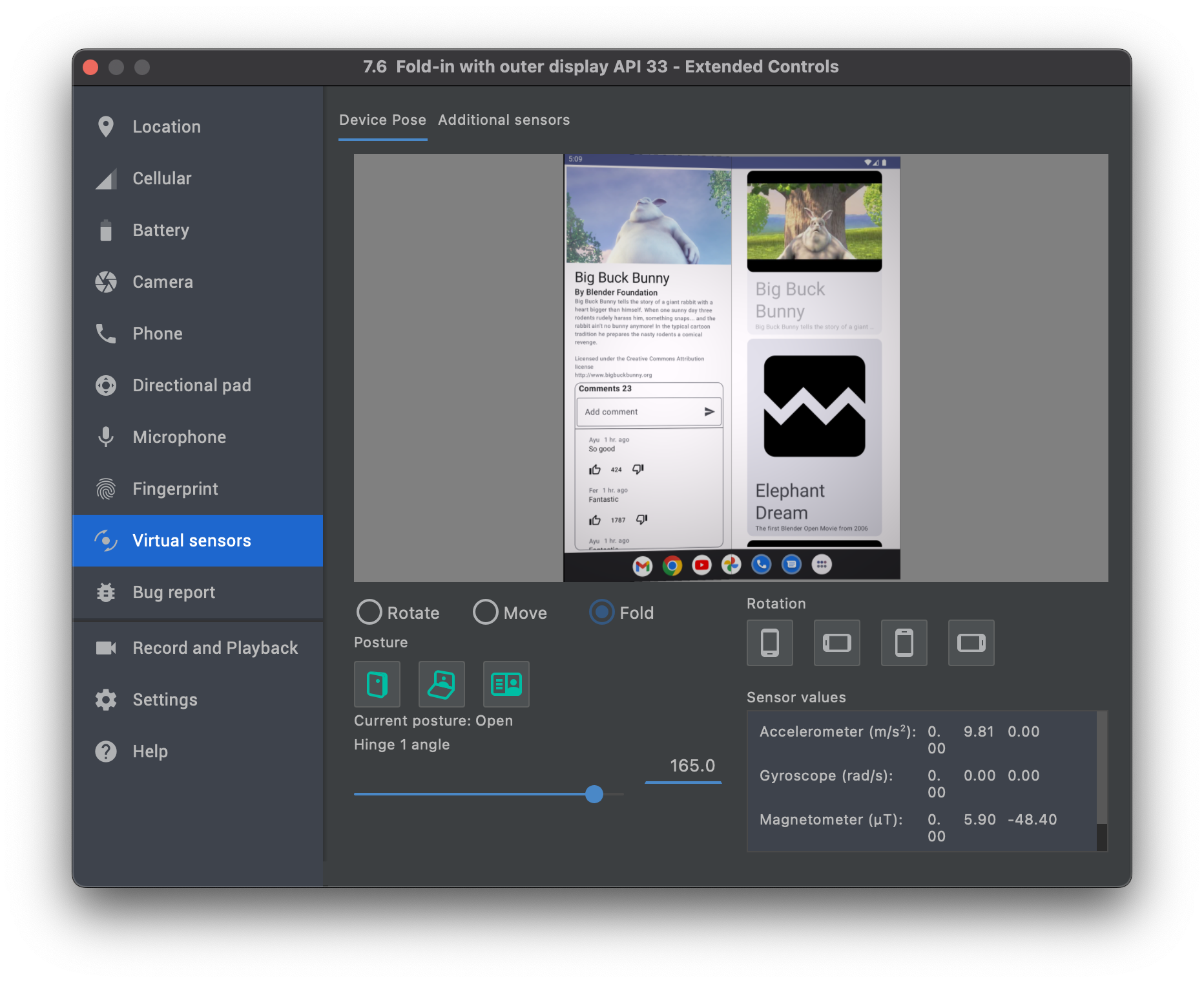 |
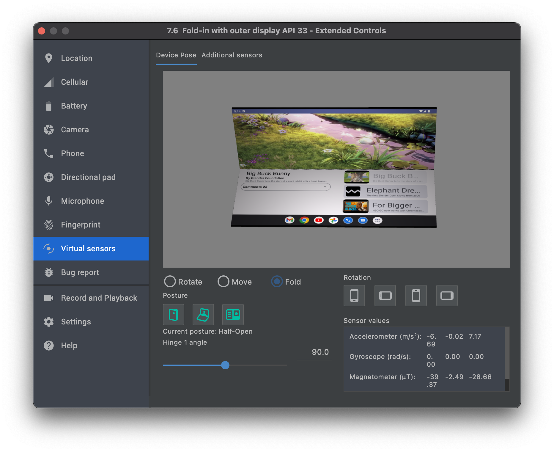 |
| Portrait mode uses both screens. The first one is for the video, video description, and comments. The second one is for the video playlist. | Half opened uses both screens. The first one is the video in full screen. The second one is divided into two parts vertically, with one part showing the video description and comments and the other part the video playlist. | |
| 6.7 Horizontal Fold-in | 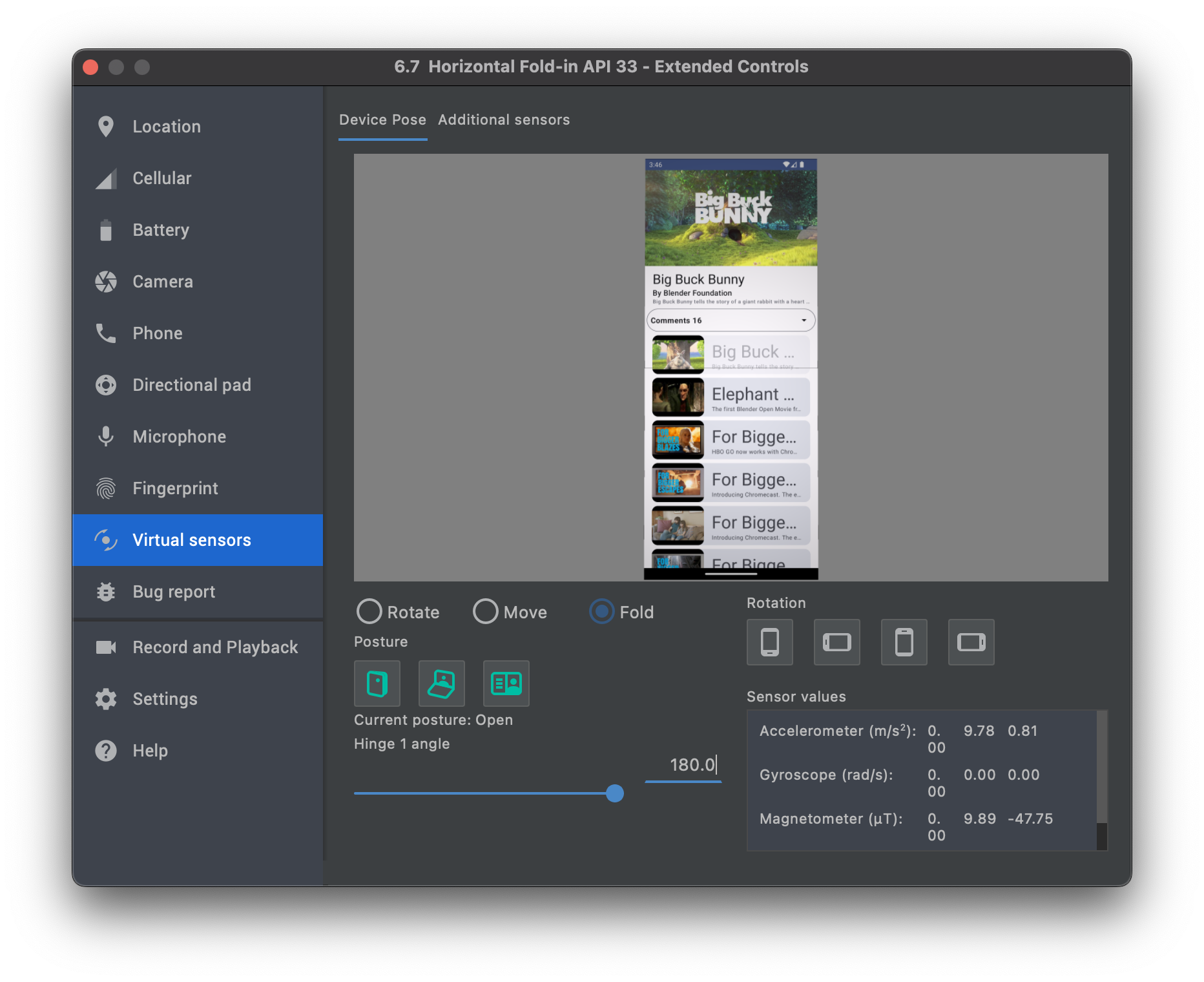 |
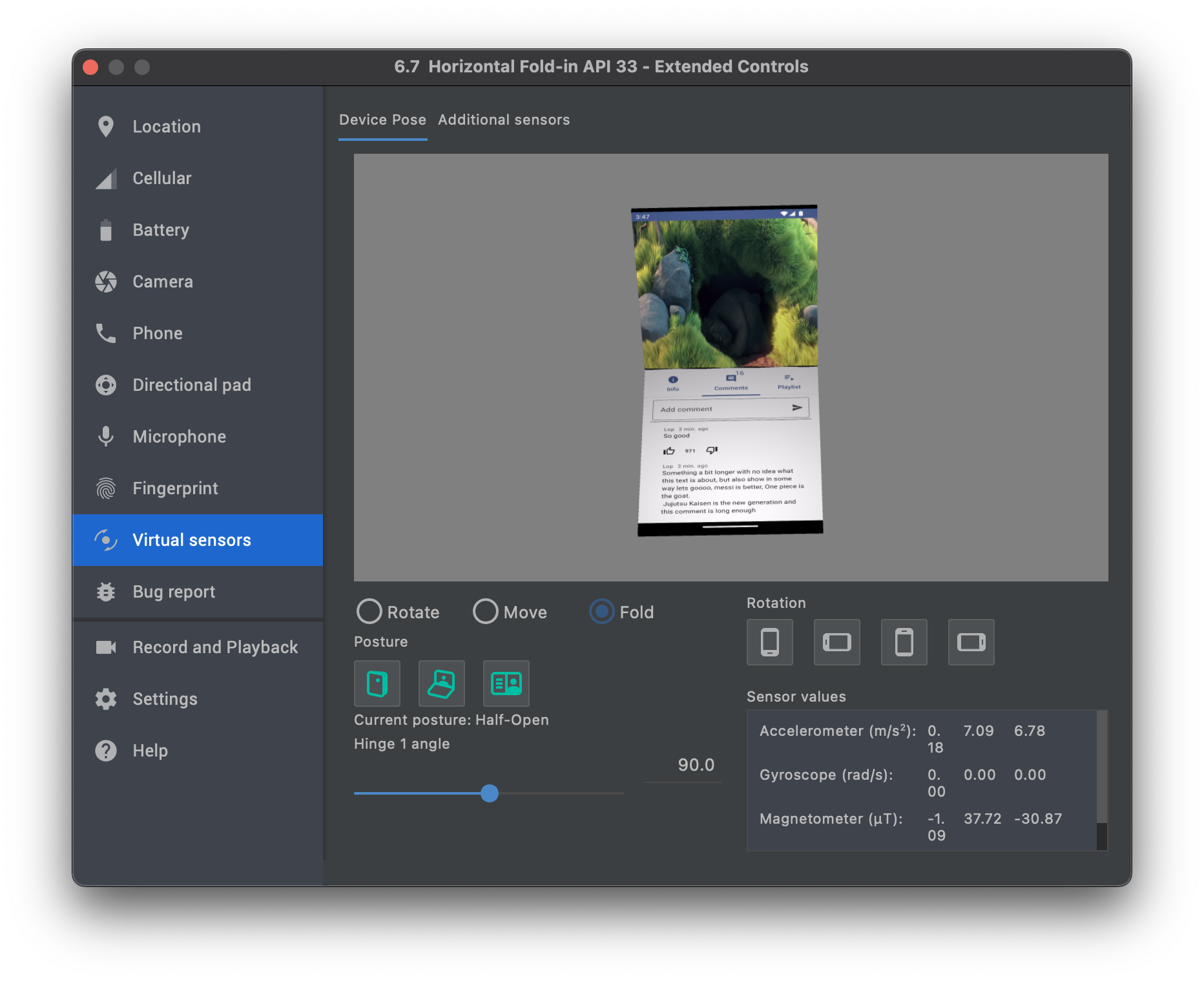 |
| Portrait mode, treating it as a normal device. | Half opened uses both screens. The first one is the video in full screen. The second one is three panes, with one showing the video description, another one showing the comments and another one showing the video playlist. |
The team at Google has provided other examples, such as Reply (application of inbox emails) with the guide for the following steps in this link.
Conclusion
Foldable smartphones are still a very recent concept, but even more recent are foldable emulators in Android Studio. The latest versions of Android Studio deliver foldable emulators able to have a 3d perspective of the emulator, but also simulate different device poses. Much of the code is still experimental and there are frequent updates but still in alpha, consult the page accompanist-adaptive for more details. Very few mobile engineers are developing applications taking into account foldable devices. The major difficulty to face when developing for foldable phones is the slowness of emulators. The available IDEs do not offer yet a comfortable and smooth developing experience for this new challenge in mobile development. Finding examples, explanations and also snippets is also another challenge to the willing developers. We can wonder what will be the impact if the development teams do not take into consideration soon enough the foldable smartphones that may start to flood the market. The layout of existing applications is most likely not going to be able to fit the constraints of foldable devices. The direct short term consequence will be the need to update existing applications code. To update the UI of existing applications, developers can follow a tutorial to migrate to Material3 and use window breakpoints, and also follow the different updates accompanist-adaptive provides.


Comments